1 自定义Behavior 1.1 基础概念 其实Behavior就是一个应用于View的观察者模式,一个View跟随者另一个View的变化而变化,或者说一个View监听另一个View。Button与TextView的爱恨情仇
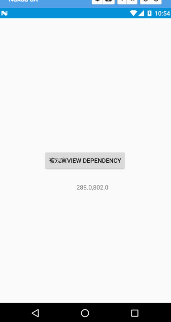
1
2
3
4
5
6
7
8
9
10
11
12
13
14
15
16
17
18
19
<?xml version="1.0" encoding="utf-8"?><android.support.design.widget.CoordinatorLayout android:layout_width="match_parent" android:layout_height="match_parent" xmlns:android="http://schemas.android.com/apk/res/android" xmlns:app="http://schemas.android.com/apk/res-auto" > <TextView app:layout_behavior=".EasyBehavior" android:layout_width="wrap_content" android:layout_height="wrap_content" android:text="观察者View child" /> <Button android:id="@+id/btn" android:layout_width="wrap_content" android:layout_height="wrap_content" android:layout_gravity="center" android:text="被观察View dependency" /> </android.support.design.widget.CoordinatorLayout>
这里我们在Activity中做一些手脚,让Button动起来(不要在意坐标这些细节)
1
2
3
4
5
6
7
8
9
10
11
12
@Override protected void onCreate(Bundle savedInstanceState) { super.onCreate(savedInstanceState); setContentView(R.layout.activity_easy_behavior); findViewById(R.id.btn).setOnTouchListener(new View.OnTouchListener() { @Override public boolean onTouch(View v, MotionEvent event) { switch (event.getAction()){ case MotionEvent.ACTION_MOVE: v.setX(event.getRawX()-v.getWidth()/2); v.setY(event.getRawY()-v.getHeight()/2); break; } return false; } }); }
此时,Button已经可以跟随手指移动了。
1
2
3
4
5
6
7
8
9
10
11
12
13
14
15
16
public class EasyBehavior extends CoordinatorLayout.Behavior<TextView> {//这里的泛型是child的类型,也就是观察者View public EasyBehavior(Context context, AttributeSet attrs) { super(context, attrs); } @Override public boolean layoutDependsOn(CoordinatorLayout parent, TextView child, View dependency) { //告知监听的dependency是Button return dependency instanceof Button; } @Override //当 dependency(Button)变化的时候,可以对child(TextView)进行操作 public boolean onDependentViewChanged(CoordinatorLayout parent, TextView child, View dependency) { child.setX(dependency.getX()+200); child.setY(dependency.getY()+200); child.setText(dependency.getX()+","+dependency.getY()); return true; } }
注意两个方法Tip
1
2
3
4
5
6
<TextView app:layout_behavior=".EasyBehavior" android:layout_width="wrap_content" android:layout_height="wrap_content" android:text="观察者View child" />
运行效果如下:
2 CoordinatorLayout使用 CoordinatorLayout是谷歌提供的Material Design许多功能的基础,使用它你可以轻松地实现许多动画效果。这些效果包括:
2.展开或者收起Toolbar为屏幕的主内容提供空间。
3.控制某个应该被收起或展开的View以一定地视差效果完成动作,包括parallax scrolling effects 动画。
FloatingActionButton可以通过layout_anchor和layout_anchorGravity来控制显示的位置。当我们将其显示到屏幕的底端时,它会自动响应SnackBar的弹起或收起:SnackBar弹起后FloatingActionButton也弹起SnackBar的高度,收起后FloatingActionButton也收起。
1
2
3
4
5
6
7
8
9
10
11
12
13
14
15
16
17
18
19
20
21
<android.support.design.widget.CoordinatorLayout android:id="@+id/main_content" xmlns:android="http://schemas.android.com/apk/res/android" xmlns:app="http://schemas.android.com/apk/res-auto" android:layout_width="match_parent" android:layout_height="match_parent"> <android.support.v7.widget.RecyclerView android:id="@+id/rvToDoList" android:layout_width="match_parent" android:layout_height="match_parent"/> <android.support.design.widget.FloatingActionButton android:layout_width="wrap_content" android:layout_height="wrap_content" android:layout_gravity="bottom|right" android:layout_margin="16dp" android:src="@mipmap/ic_launcher" app:layout_anchor="@id/rvToDoList" app:layout_anchorGravity="bottom|right|end"/> </android.support.design.widget.CoordinatorLayout>
1.确保CoordinatorLayout是主容器。
1
2
3
4
5
6
7
8
9
10
11
12
13
14
<android.support.design.widget.CoordinatorLayout xmlns:android="http://schemas.android.com/apk/res/android" xmlns:app="http://schemas.android.com/apk/res-auto" android:id="@+id/main_content" android:layout_width="match_parent" android:layout_height="match_parent" android:fitsSystemWindows="true"> <android.support.v7.widget.Toolbar android:id="@+id/toolbar" android:layout_width="match_parent" android:layout_height="?attr/actionBarSize" app:popupTheme="@style/ThemeOverlay.AppCompat.Light" /> </android.support.design.widget.CoordinatorLayout>
2.为了响应滑动事件,我们必须使用AppBarLayout:
1
2
3
4
5
6
7
8
9
10
11
12
13
14
<android.support.design.widget.AppBarLayout android:id="@+id/appbar" android:layout_width="match_parent" android:layout_height="@dimen/detail_backdrop_height" android:theme="@style/ThemeOverlay.AppCompat.Dark.ActionBar" android:fitsSystemWindows="true"> <android.support.v7.widget.Toolbar android:id="@+id/toolbar" android:layout_width="match_parent" android:layout_height="?attr/actionBarSize" app:popupTheme="@style/ThemeOverlay.AppCompat.Light" /> </android.support.design.widget.AppBarLayout>
为了让滑动的View始终在AppBarLayout的下面,需要为滑动的View定义layout_behavior为@string/appbar_scrolling_view_behavior。我们还可以通过app:layout_scrollFlags控制AppBarLayout中的子View响应RecycleView的滑动。
1
2
3
4
5
6
7
8
9
10
11
12
13
14
15
16
17
18
<android.support.design.widget.AppBarLayout android:layout_width="match_parent" android:layout_height="wrap_content" android:fitsSystemWindows="true" android:theme="@style/ThemeOverlay.AppCompat.Dark.ActionBar"> <android.support.v7.widget.Toolbar android:id="@+id/toolbar" android:layout_width="match_parent" android:layout_height="?attr/actionBarSize" app:layout_scrollFlags="scroll|enterAlways"/> <android.support.v7.widget.RecyclerView android:id="@+id/rvToDoList" android:layout_width="match_parent" android:layout_height="match_parent" app:layout_behavior="@string/appbar_scrolling_view_behavior"/> </android.support.design.widget.AppBarLayout>
关于layout_scrollFlags的值这里解释一下:
scroll - 想滚动就必须设置这个。
enterAlways - 实现quick return效果, 当向下移动时,立即显示View(比如Toolbar)。
exitUntilCollapsed - 向上滚动时收缩View,但可以固定Toolbar一直在上面(可通过minHeight设置)。
enterAlwaysCollapsed - 当你的View已经设置minHeight属性又使用此标志时,你的View只能以最小高度进入,只有当滚动视图到达顶部时才扩大到完整高度。
snap - 如果头部滑动操作超过50%的距离,则自动关闭。如果头部滑动操作不超过50%的距离,则不关闭。
2.3 创建折叠效果 CollapsingToolbarLayout作用是提供了一个可以折叠的Toolbar,它继承至FrameLayout,给它设置layout_scrollFlags,它可以控制包含在CollapsingToolbarLayout中的控件(如:ImageView、Toolbar)在响应layout_behavior事件时作出相应的scrollFlags滚动事件(移除屏幕或固定在屏幕顶端)。
1
2
3
4
5
6
7
8
9
10
11
12
13
14
15
16
17
18
19
20
21
22
23
24
25
26
27
28
29
30
31
32
33
<android.support.design.widget.AppBarLayout android:layout_width="match_parent" android:layout_height="256dp" android:fitsSystemWindows="true"> <android.support.design.widget.CollapsingToolbarLayout android:id="@+id/collapsing_toolbar_layout" android:layout_width="match_parent" android:layout_height="match_parent" app:contentScrim="#30469b" app:expandedTitleMarginStart="48dp" app:layout_scrollFlags="scroll|exitUntilCollapsed"> <ImageView android:layout_width="match_parent" android:layout_height="match_parent" android:scaleType="centerCrop" android:src="@mipmap/bg" app:layout_collapseMode="parallax" app:layout_collapseParallaxMultiplier="0.7" /> <android.support.v7.widget.Toolbar android:id="@+id/toolbar" android:layout_width="match_parent" android:layout_height="?attr/actionBarSize" app:layout_collapseMode="pin" /> </android.support.design.widget.CollapsingToolbarLayout> <android.support.v7.widget.RecyclerView android:id="@+id/recyclerView" android:layout_width="match_parent" android:layout_height="match_parent" app:layout_behavior="@string/appbar_scrolling_view_behavior" android:scrollbars="none" /> </android.support.design.widget.AppBarLayout>
1、在CollapsingToolbarLayout中设置了一个ImageView和一个Toolbar。并把这个CollapsingToolbarLayout放到AppBarLayout中作为一个整体。
contentScrim - 设置当完全CollapsingToolbarLayout折叠(收缩)后的背景颜色。
expandedTitleMarginStart - 设置扩张时候(还没有收缩时)title向左填充的距离。
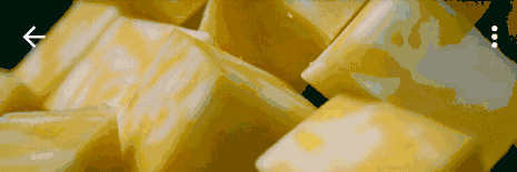
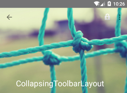
没扩张时候如图:
2、在ImageView控件中:
pin - 设置为这个模式时,当CollapsingToolbarLayout完全收缩后,Toolbar还可以保留在屏幕上。
parallax - 设置为这个模式时,在内容滚动时,CollapsingToolbarLayout中的View(比如ImageView)也可以同时滚动,实现视差滚动效果,通常和layout_collapseParallaxMultiplier(设置视差因子)搭配使用。
layout_collapseParallaxMultiplier(视差因子) - 设置视差滚动因子,值为:0~1。
3、在Toolbar控件中,我们设置了layout_collapseMode(折叠模式)为pin。
综上分析:当设置了layout_behavior的控件响应起了CollapsingToolbarLayout中的layout_scrollFlags事件时,ImageView会有视差效果的向上滚动移除屏幕,当开始折叠时CollapsingToolbarLayout的背景色(也就是Toolbar的背景色)就会变为我们设置好的背景色,Toolbar也一直会固定在最顶端。
注意:
2.4 Bottom Sheet 有两种类型的Bottom Sheet :Persistent bottom sheet : 通常用于显示主界面之外的额外信息,它是主界面的一部分,只不过默认被隐藏了,其深度(elevation)跟主界面处于同一级别;还有一个重要特点是在Persistent bottom sheet打开的时候,主界面仍然是可以操作的。ps:Persistent bottom sheet该如何翻译呢?我觉得翻译为普通bottom sheet就好了,还看到有人翻译为“常驻bottom sheet”,可能更接近于英语的字面意思,可是反而不易理解。
2.模态bottom sheet : 顾名思义,模态的bottom sheet在打开的时候会阻止和主界面的交互,并且在视觉上会在bottom sheet背后加一层半透明的阴影,使得看上去深度(elevation)更深。
参考资料 CoordinatorLayout介绍